04 / Mobile App
Eluxi
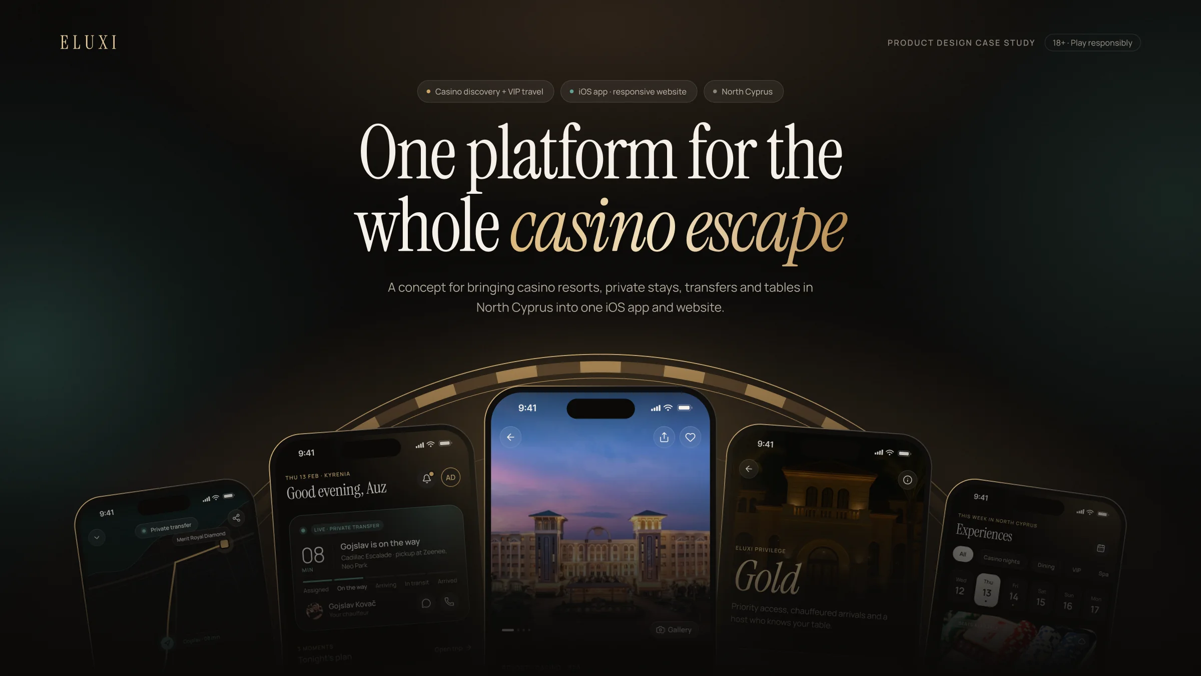
Planning a casino trip meant moving between hotels, casino tables, transport and messages. Eluxi brings those steps into one trip — planned before the visit and easy to follow on the night.
Services
- Product audit
- Desk research
- Competitive review
- UX architecture
- Interaction design
- Design system
- Prototyping
At a glance
- The problem
- The existing app split casino discovery, table booking and rides into separate flows. A guest had no single view of the whole evening.
- What I designed
- One connected trip: a trip builder, three-step table booking, live transfer status, a clear My Trip view and responsible-play controls.
- My role
- Product audit, desk research, competitive review, UX architecture, interaction design, design system, UI and prototype.
- Research
- Desk research and product review only. No interviews, usability tests or launch data were available for this version.
The context
One guest journey, across the whole evening
- Status
- Designed and prototyped — not yet built, released or tested with guests.
- Journey
- Discover → Plan → Book → Travel → Arrive → Ask → Control
One guest journey across stay, casino, dining, events and transport. The website starts the journey; the iOS app runs it.
The redesign starts from the existing app, then joins the separate flows around one trip. The website introduces the experience; the iOS app helps run it.
Problem discovery
Three flows. One evening.
01 What I reviewed
- The existing 17-screen app and its flows.
- The project brief and product deck.
- Reference products: Booking.com, Uber and Tripadvisor.
- Current resort-app patterns from MGM Resorts and Resorts World Las Vegas.
02 What the review showed
- The strongest products solve one part of the trip very well, then make the next step easy to find.
- Live services make status visible without forcing the user to search again.
- Resort apps already combine hotel, dining, entertainment and rewards — but services are often still organised as separate sections.
- For Eluxi, the opportunity was not to copy one product. It was to connect the useful patterns around one guest trip.
It looked likeBrowse a casino → book a table → book a ride.
It needed to becomePlan one evening → keep the itinerary → follow what happens next.
03 The problem statement
How might we help a guest plan and run one casino evening, while keeping the next important step, money and time clear?
Research findings
A trip view is more useful than three separate service flows.
A guest needs to know how the stay, table and transfer fit together.
Make the trip the main organising object: Trip Builder + My Trip.
Time becomes the main UI on the night.
Table times, pickup windows and event times are fixed points.
Show done / now / next, ETAs and a live evening mode.
Accuracy is part of trust.
The source app contained wrong locations, placeholder copy and unrelated imagery.
Use sourced facts, mark demo values and remove unsupported claims.
Responsible play belongs in the product flow.
The source experience had bonus language and no visible limits or 18+ notice.
Put limits, reminders and responsible-play information near money and booking.
Competitive review
What existing products do well — and what Eluxi can borrow
| Dimension | Focus | What it does | Takeaway |
|---|---|---|---|
| Booking.com | Trip planning | Reservations and trip information are kept under the account and itinerary. | Group trip items so the guest can see the whole plan. |
| Uber | Live transport | The app puts current trip status, ETA and vehicle details close to the user; Live Activities reduce the need to reopen the app. | Show the next time-critical item without making the guest search. |
| Tripadvisor | Discovery + planning | Discovery, reviews and saved trips help users build and organise a day-by-day plan. | Separate discovery from the active trip, then connect them. |
| MGM / Resorts World | Resort experience | Their apps and concierge tools cover hotel, dining, shows, rewards and guest help. | Combine services, but keep the guest journey simple instead of creating a menu of features. |
Research note: desk-research benchmark only; these are not direct competitors. Sources: Booking.com, Uber, Tripadvisor, MGM Resorts and Resorts World Las Vegas.
The goal
Make one casino evening easier to plan and easier to run.
One trip view
Clear next step
Short booking flows
Visible money and time controls
No unsupported claims
The opportunity
Five product opportunities
Connect the trip
Trip Builder turns separate bookings into one itinerary.
Show what matters now
Home changes from planning mode to live evening mode.
Make payment clear
Review & Pay explains the deposit before payment.
Keep control visible
Wallet and Play Responsibly keep limits and reminders close to money.
Keep the concierge human
One conversation gives the guest a simple way to ask for help.
The approach
Simple rules for every screen
Five simple rules guide the product: trip first, next before new, one clear action, live status is easy to scan, and people are available when the app cannot answer.
- 01
Trip before service
The guest should always know where they are in the evening.
- 02
Next before new
Show the next important action before more things to explore.
- 03
Live means status
Use one visual language for moving or time-sensitive information.
- 04
Gold means action
Reserve gold for the main action and selected premium states.
- 05
People when needed
Concierge, chauffeur and venue support should feel like one service.
Information architecture
Five destinations and one live layer
Home
- Today
- Next step
- Live status
Discover
- Casinos
- Stays
- Events and experiences
Trips
- Itinerary
- Builder
- Transfers and passes
Concierge
- Requests
- One conversation
Account
- Wallet
- Privilege
- Responsible play
Live layer
- Home + Trips status
- Lock Screen
- Passes
- Notifications
Key journey
Reserve a table in three steps
- User objective
- Secure a table at a specific casino and time without moving through eight similar screens.
- What makes it hard
- Availability changes, a deposit is involved, and payment can fail.
- Design response
- Three focused steps plus a pass. Availability is shown in words, the deposit is explained before payment, and the confirmed pass works offline.
01Choose
Casino detail
Show the venue, table types, VIP options, events and deposit before the guest starts booking.
02Step 1
Game and time
Show availability in words and time, not colour alone.
03Step 2
Seats and requests
A seat map plus simple preferences for the host.
04Step 3
Review and pay
State the deposit clearly before the guest pays.
05Pass
Table confirmed
Explain the deposit before payment. After confirmation, give the guest an offline QR pass and one clear next step.
Key takeawayReduce the flow to decisions, not screens. Handle the important failure states inside the same journey.
Key takeawayThe flow has a clear end state — and designed states for a full table or failed payment.
The live evening
The live evening
Before the trip, Home helps plan. During the trip, Home promotes the most time-sensitive item: transfer, table or check-in. A live transfer sheet and Lock Screen status keep the guest informed.
Exploration
What changed while designing
There was no user-test round in this version. Exploration came from checking the file against the brief, the research findings and the product rules.
Trip countdown: A large place name + countdown was too close to the reference.
Changed to a simple trip strip: Arrive · Stay · Starts in.
Booking steps: The UI showed five steps for a three-screen flow.
Changed the indicator to three.
Live status: Different screens used different state counts.
Unified the live transfer to five states.
Content checks: Some dates, labels and text did not agree.
Corrected the content and ran a full-file consistency check.
Key decisions
Decisions, reason and risk
Decision 01
One concierge thread
- Challenge
- Separate venue and driver chats create extra work.
- Decision
- One conversation with request shortcuts.
- Why
- It makes help easier to find.
- Risk
- Staffing and response time become part of the promise.
Decision 02
Trip as the main object
- Challenge
- Three flows do not show how the evening fits together.
- Decision
- Trip Builder + My Trip.
- Why
- The guest can see the plan and what comes next.
- Risk
- The itinerary needs reliable booking data.
Decision 03
Aegean means live; gold means action.
- Challenge
- A dark premium UI can make every element compete for attention.
- Decision
- Use Aegean only for live status. Use gold for the main action and selected premium states.
- Why
- A guest should know what is happening now and what to tap at a glance.
- What it enables
- Colour cannot carry meaning alone, so status also uses text and clear labels.
Decision 04
Put limits and reminders inside the main product.
- Challenge
- The source experience used bonus language and did not make limits or 18+ status clear.
- Decision
- Add deposit limits, session reminders, spend alerts, time-outs and a Play Responsibly area. Show limits near Wallet and payment.
- Why
- Money and time controls should be easy to find, not hidden in a footer.
- What it enables
- This still needs legal and responsible-gambling review before any public use.
Trade-offs
Five tabs
Simple mental model
Some information appears in more than one place.
Home has two modes
Planning first, live later
The exact switch rule needs product validation.
Three-step booking
Fewer repeated screens
Every venue needs clear availability data.
One transfer sheet
One pattern for many ride states
Needs reliable live partner data.
The product
The final experience: plan, ask, stay in control
The design connects the website and app around one guest trip. The website introduces the destination and product; the app helps the guest plan, book, travel and get help.
Trip Builder + My Trip
Three-step table booking + offline pass
Live transfer status + Lock Screen
Concierge conversation
Wallet + responsible-play controls
Drag or scroll →
Edge cases
Every journey has edges
A complete product needs clear states for failure and change. Designed states cover full tables, failed payment, transfer updates, pass access and other points where the guest could otherwise get stuck.
Design system
Warm obsidian, gold used sparingly
The existing app did not have a shared system. The redesign uses 149 variables, 49 component sets and 303 variants. The goal is consistency: dark neutrals carry the UI, Aegean marks live status, and gold marks the main action.
- Obsidian#0a0908
neutral/1000 - Surface#151311
neutral/900 - Ivory#f5f0e8
neutral/50 - Champagne gold#cfa566
gold/400 · action - Deep gold#8e6a41
gold/600 - Aegean#64a096
aegean/400 · live
- EditorialAaInstrument Serif for names and editorial moments.
- Functional21:30Manrope for functional UI and information.
How AI was used
AI helped with production. Product decisions stayed with me.
- Production
Claude was used through the Figma Plugin API to speed up screen production and file updates.
- Review
The work was checked against the brief, the audit, the competitive review and the design rules.
- Limits
This was not user research. No user or stakeholder feedback, usability testing or launch data was used in this case study.
Before → after
From three separate tasks to one guest trip
Home
Service list / separate entry points
Home leads with today and next.
Table booking
Many repeated screens
Three steps + one pass.
Ride
Separate booking flow
Live transfer sheet + Lock Screen.
Trip
No shared trip view
Trip Builder + My Trip.
Design outcome
Design outcome
31 app screens across 8 areas, 18 edge-case states, a responsive website and a six-flow prototype.
Three flows → one trip
Service status → live layer
Bonus-led content → responsible play
Repeated booking screens → three clear steps
Design review
What the design solves — and what is still open
- Strengths
- One connected guest journey
- Clear live status
- Short booking flow
- Responsible-play controls
- Shared design system
- Gaps
- No guest testing yet
- Concierge staffing not designed
- Partner tools are out of scope
- Some imagery is placeholder
- Opportunities
- Add real availability and transfer data
- Validate the core booking flow with guests
- Connect partner operations
- Use production venue photography
- Risks
- Gaming rules can affect promotion and payments
- Live features depend on partner data
- Responsible-gambling flows need expert review
Challenges
The hard part was making the product believable
No user research
Used the existing app, project brief, product deck and desk research. Kept testing as the next step.
Messy source content
Removed unsupported copy, corrected obvious mismatches and treated demo values as illustrative.
Casino + responsible play
Removed bonus-led language and placed limits, reminders and 18+ information in the core experience.
Live data
Designed clear states, but marked partner data and operational support as open work.
What I learned
What I learned
A trip is the product
The useful unit was not a casino, ride or hotel. It was the evening they were part of.
State design matters
Reducing repeated screens worked because the flow was designed as states first.
Trust comes from accuracy
Wrong places, dates or payment details can break confidence faster than visual polish can build it.
Research can still be clear without inventing evidence
Desk research and product audit gave direction; real guest testing is the next proof point.
Three disconnected flows became one evening — a product experience built around planning, booking and the night itself.
Next: validate the reservation and transfer flows with guests, connect real partner data, replace placeholder imagery, and complete legal and responsible-gambling review.