03 / Website / 2026
Integrity
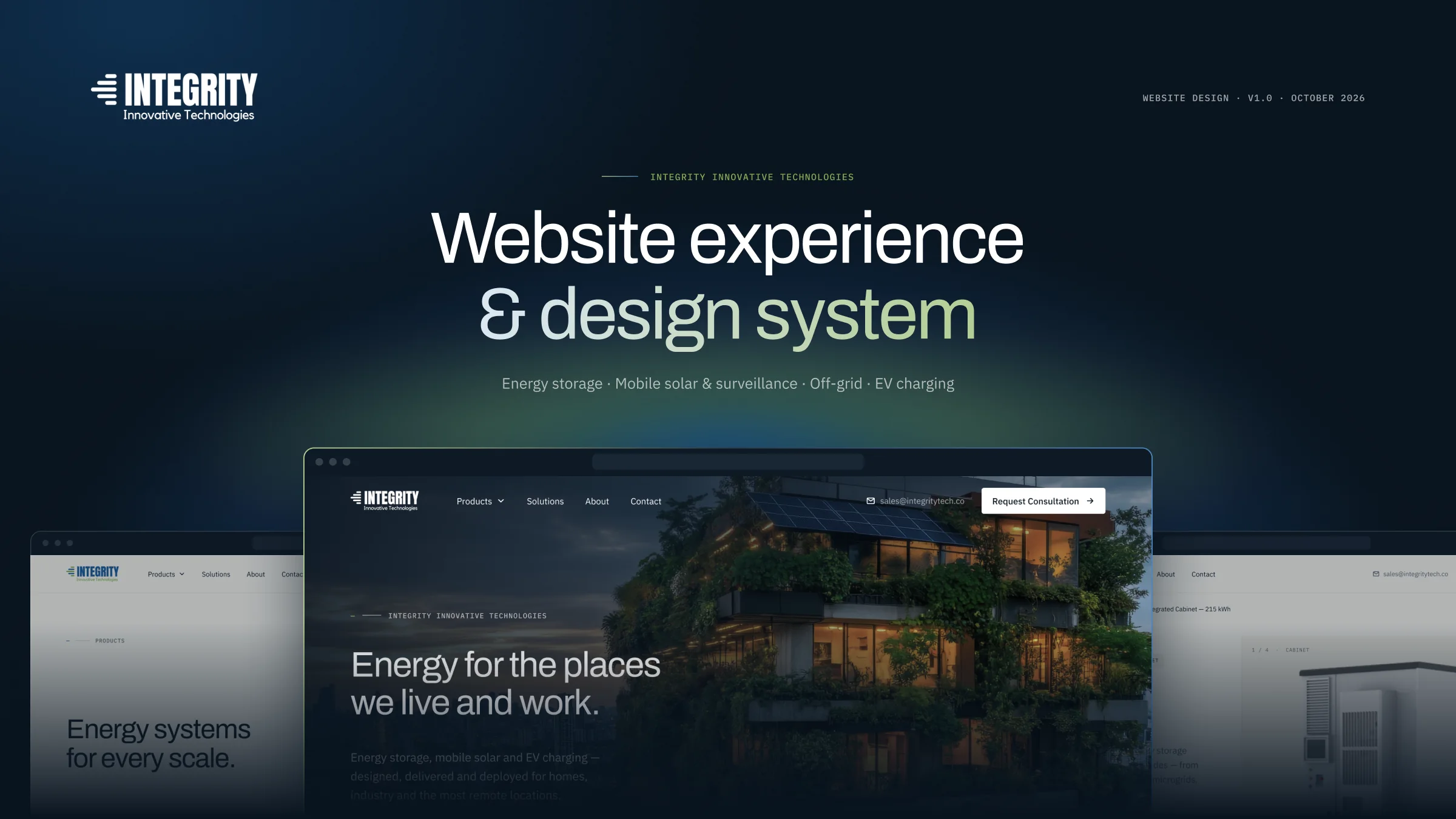
A green energy company with a complex digital journey. The website was designed to make the information easier to understand, easier to explore, and easier for buyers to take the next step.
Services
- Content audit
- Information architecture
- Art direction
- Design system
- Responsive web design
- Prototyping
At a glance
- The problem
- Integrity needed a clear website to explain its green energy solutions to very different buyers. The source material was technical, and the site needed stronger trust signals.
- What I designed
- A responsive B2B website and design system: a navigable catalogue, a readable specification system and one consultation path from every page.
- My role
- Product designer — content audit, IA, art direction, design system, responsive design and prototyping.
- AI
- Production in Figma was AI-assisted. The brief, references, content, art direction and iteration decisions were mine.
The context
A broad green energy offering — with no clear digital journey
- Solution range
- A range of energy solutions
- Experience type
- Editorial site · product catalogue · specification reference · lead form
Integrity works across green energy, including energy storage, mobile solar and EV charging. The company needed a clear digital home where buyers could understand the solutions and take the next step.
The brief: a premium corporate website and product catalogue built around one conversion — Request Consultation. There is no cart or checkout; every flow leads to a conversation. The company’s existing product material — a 21-page print brochure — was the content source for every product, figure and claim on the site.
Problem discovery
A wide offering. Buyers arrive with one question.
01 What I started with
- The brief: a premium corporate site and product catalogue around one conversion, Request Consultation — no cart, no checkout.
- The company’s existing product and company information, from its print brochure — the foundation for understanding the offering.
02 What the work revealed
- Different energy solutions serve very different buyers — installers, industrial energy leads, remote-site and EV-site operators — each arriving with one need.
- The offering was organised as one linear sequence; online, a buyer looking for one system shouldn’t have to move through the rest.
- Specifications — what B2B buyers actually compare — weren’t structured for scanning or comparison.
- Mislabelled capacities and missing per-model specs.
- No phone, team, customers or certifications beyond battery standards to build trust on.
03 The problem statement
How might buyers with very different needs find the right energy solution, understand and compare it with confidence, and reach a conversation — on a site that claims nothing the company can’t support?
From the brief and the content audit in the project file.
Content audit
What the content needed to work online
The company’s material described the offering for print. Online, buyers navigate, compare and act — so the structure had to change as much as the style.
Canva layouts with saturated blue spec boxes and inconsistent type.
Specifications are what B2B buyers compare — they need to be scannable, not decorative.
A typographic specification system: key figures, tables and meters.
Different energy solutions presented as a linear printed sequence.
Buyers arrive with one need and shouldn’t have to page through the rest.
A Products mega-menu and family pages, so any product is two steps from anywhere.
Mislabelled capacities and missing per-model specs.
Wrong numbers on an engineering site cost credibility.
Issues flagged to the client and shown as “available on request” — nothing invented.
Mostly low-resolution renders.
A premium positioning needs premium imagery.
Products presented cut-out on warm stone; high-res originals flagged before launch.
No phone, team, customers or certifications beyond battery standards.
Trust signals are usually what B2B sites lean on.
Trust built from precision instead: sourced figures, clear diagrams, a calm voice.
From the content audit documented in the project file.
Who it’s for
Who the site serves
Each audience arrives with a different question, but all of them end in the same action.
- Commercial & industrial
Energy leads
- Compare capacity and lifecycle
- Understand integration with existing power
- Residential
Homeowners & installers
- Find the right home system
- Check backup and solar fit
- Remote sites
Site operators
- Mobile solar, light towers and CCTV
- Off-grid reliability
- Mobility
EV-site operators
- AC vs DC charging
- Power range per site
Defined from the product applications in the company’s material.
The goal
Make a catalogue buyers can act on
- Design goals
What the design had to achieve
- Any product within two steps of any page
- A consultation path from every template
- Specs scannable and comparable
- AA contrast and 44 px targets at every width
- Product KPIsNot measured
Success metrics after launch
- Consultation requests per month
- Product page → request rate
- Form completion and error rate
- Requests by product family
No analytics or results were available — the site has not been measured.
The approach
Engineered calm
Serious energy infrastructure presented with editorial confidence — the product and the place it works are the heroes, never abstract “tech”.
- 01
Products on warm stone
Real renders, generous padding, no props — instead of AI gradients and neon.
- 02
Data-led specifications
Typographic spec layouts and meters instead of decorative boxes.
- 03
Dark ink chapters
Alternating with paper-light sections to pace a long product story.
- 04
Green as a signal
Meters, flows and index marks — never body text, never decoration.
Information architecture
Five page types, one path
A small set of templates carries the solution range — and every template ends in the same conversion.
Home
Orient
- Category explorer
- System diagram
- Reliability figures
Products
Choose a solution
- Solution range
- Mega-menu entry
- Featured product
Product detail
Decide
- Key specs
- Spec tables
- Applications
- Related systems
About
Trust
- Vision & mission
- Design · Deliver · Deploy
Contact
Convert
- Pre-filled request
- Validation
- Success
On every page
- Request Consultation in the nav
- Products mega-menu
- Contact in the footer
Page inventory as documented in the project file.
Product storytelling
Explaining systems, not just listing products
A category explorer swaps its preview as you move through the solution range. A redrawn system diagram shows how generation, conversion, storage and loads connect.
Reliability is shown with figures taken straight from product documentation — cycles, efficiency, ingress rating — each one sourced, nothing estimated.
Key journey
Everything leads to a conversation
- User objective
- Go from “is this right for my site?” to talking to someone who knows.
- What makes it hard
- High-consideration B2B purchases, many models, and no checkout to fall back on.
- Design response
- Every page ends in Request Consultation, and the form arrives pre-filled with the product being viewed.
01Discover
Solution
Every family page ends in one clear next step.
02Decide
Product detail
Key specs, applications and a consultation CTA.
03Request
Pre-filled form
Errors announced inline with icon and text, not colour alone.
04Confirm
Request sent
What happens next, and when to expect a reply.
Key takeawayRemoving a checkout didn’t remove the funnel — it made a single, well-supported action the funnel.
Key decisions
Decisions behind the clarity
Decision 01
Specifications people can read
- Challenge
- In the existing material, specs sat in saturated blue boxes that were hard to scan and impossible to compare.
- Decision
- A typographic spec system: lead with the key figures, then structured tables, with a request-datasheet path for anything missing.
- Why
- B2B buyers compare numbers; the layout should make comparison effortless.
- What it enables
- Every product page reads like a clear specification reference.
Decision 02
Solution range, one menu
- Challenge
- A broad range of energy solutions can overwhelm a top navigation.
- Decision
- One Products mega-menu, opening on hover or focus with a short intent delay, listing the solution range plus a featured product.
- Why
- The catalogue can grow without changing the navigation.
- What it enables
- Any product is two steps from any page.
Decision 03
A consultation that already knows the context
- Challenge
- Generic contact forms make buyers repeat what they were just reading.
- Decision
- Request Consultation pre-fills the product being viewed; validation is inline and announced with icon and text.
- Why
- Lower effort at the single most important moment on the site.
- What it enables
- The conversion step carries context instead of starting from zero.
Decisions as documented in the project file’s direction and responsive boards; results describe design intent, not measured outcomes.
Trade-offs
What I chose — and what it costs
A cart and self-serve purchase.
Consultation only — every page ends in Request Consultation, pre-filled with the product.
No self-serve purchase for smaller buyers.
Fill gaps so every product page looks complete.
Show only what the company’s material supports; flag gaps as “available on request”.
Some pages are thinner; one product stays off the site entirely.
Lead with the full catalogue.
Editorial storytelling on Home, with the mega-menu for direct access.
A longer scroll before the full catalogue.
Typical “tech” visuals — gradients, neon glows, particles.
Products on warm stone: real renders, generous padding, no props.
Relies on product renders, mostly low-resolution — flagged for high-res originals.
Field Green as a brand colour across the page.
Green as a signal only — meters, flows and index marks.
Less brand colour on the page.
Options from the direction board and brief; trade-offs follow from the documented decisions.
Responsive experience
Recomposed, not shrunk
Grids step 12 → 8 → 4. Navigation becomes a full-screen dark menu with the consultation CTA always visible; spec tables turn into accordions and product pages gain a sticky CTA bar.
Design system
A brand kept, a system built
The brand had a logo and two colours but no system. 77 variables, 25 text styles and 21 component sets were built before any page, so five templates could carry the solution range consistently. Body text meets at least 4.5:1 on every surface, with a visible focus ring and 44 px touch targets.
- Integrity Blue#1c5c9a
blue/600 - Field Green#82aa54
green/500 - Ink#08131e
ink/950 - Warm stone#eeece6
stone/100 - Paper#f6f5f1
stone/50 - Slate#5d6874
slate/500
- DisplayAaArchivo — headlines
- Text & data215 kWhIBM Plex Sans & Plex Mono
How AI was used
AI-assisted production, designer-led decisions
- AI-assisted
Production inside Figma
Production was AI-assisted inside Figma — the file name, “Integrity through claude”, reflects this.
- Designer
What I decided
- The brief and the references
- The content source — the company’s product material
- Art direction
- Iteration decisions: hero, imagery, type scale and logo size
Roles as recorded in the project file’s case-study board.
Design outcome
Design outcome
- Delivered
A site and its system
- 9 desktop, 1 tablet and 6 mobile frames
- 21 component sets, 36 icons
- A prototype with 149 interactions across 2 flows
- What the site does
From offering to action
- Solution range → a navigable catalogue, any product two steps away
- Decorative specs → a comparable specification system
- No digital presence → one consultation path from every page
- Before launch
Flagged for the client
- Missing per-model specs
- Inconsistencies in the source material
- High-resolution photography
What I learned
What I learned
Precision is a trust signal
Without customers or certifications to show, sourced figures and clear diagrams carried credibility.
One action simplifies everything
Designing every template around a single conversion made the IA easy to reason about.
Flag, don’t fill
Marking gaps as “available on request” kept the site honest and gave the client a clear list.
A clear green energy range, one coherent system — and a site that leads every visitor to the right conversation.