01 / Mobile App
Spotz
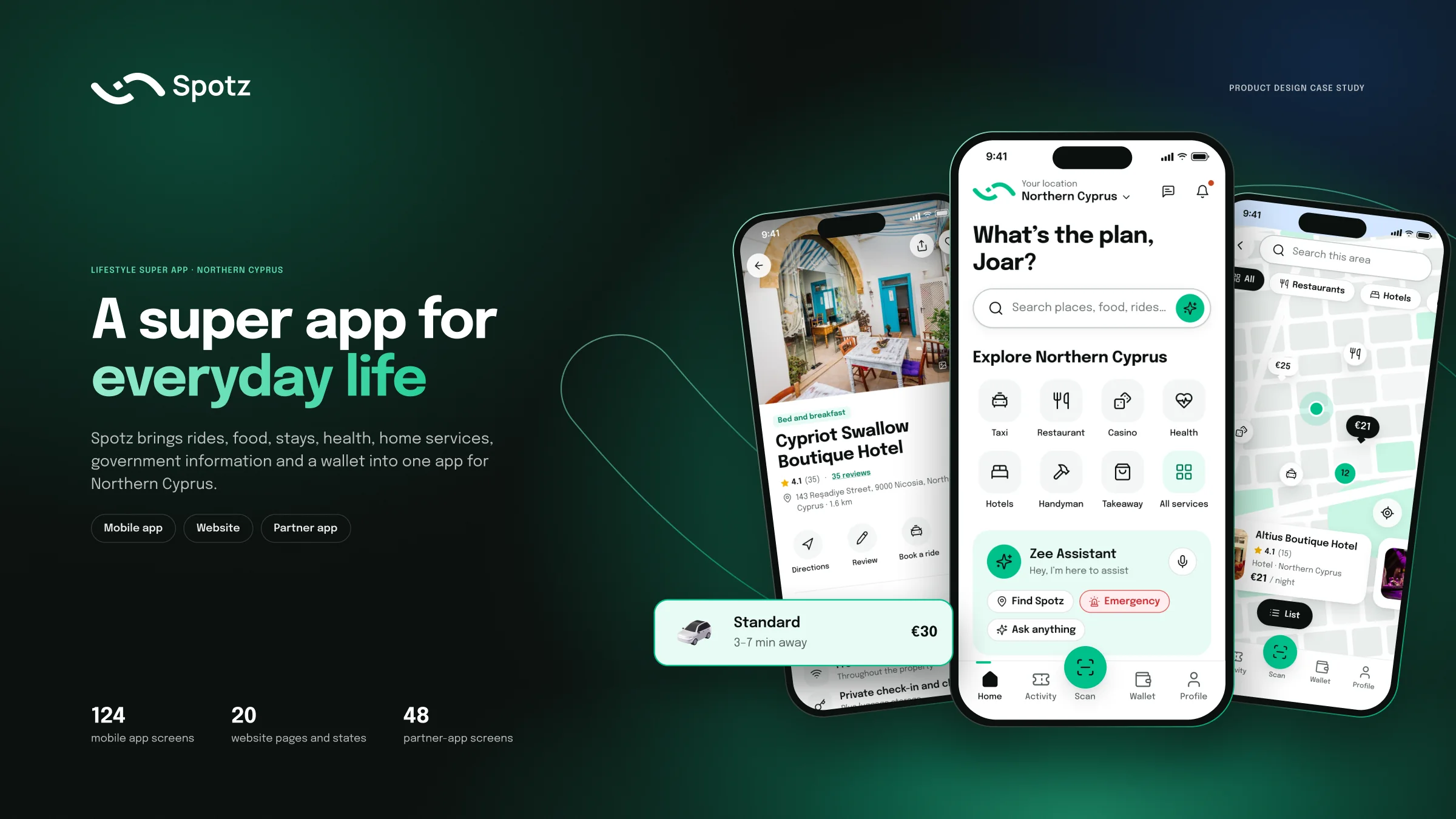
A unified service platform for North Cyprus — helping people discover, book, pay for and manage local services, while giving businesses a simpler way to manage bookings and visibility.
Services
- Product audit
- Information architecture
- UX/UI design
- Design system
- Prototyping
- UX writing
- Accessibility
At a glance
- The market problem
- North Cyprus had a fragmented local service ecosystem. People needed an easier way to discover and book everyday services, while businesses needed a clearer digital way to manage bookings, visibility and payments.
- The product problem
- The existing experience also behaved inconsistently: services used different patterns, bookings had no clear home, recovery states were missing, and reusable UI was limited.
- My role
- Product audit, information architecture, UX/UI, design system, prototyping, UX writing and accessibility.
- Product scope
- Customer app + partner app + website, covering transport, hotels, restaurants, health, nightlife and other local services.
The product problem
The challenge was not simply to add more services.
It was to make a growing multi-service product feel like one understandable product.
Problem discovery
Two problems surfaced
The original research explained the market gap. The product audit showed where the existing experience was breaking down.
01 What the original research showed
- Local businesses lacked one clear platform for bookings, visibility and payments.
- Vendors were often relying on WhatsApp or manual methods for bookings and customer communication.
- Tourists wanted one place to discover, book and pay instead of switching between unfamiliar services.
- Research included competitor benchmarking, vendor interviews, journey mapping and user flows.
02 What the product audit revealed
- Every service behaved differently, making the product feel like a collection of separate apps.
- After payment, confirmations could lead to Profile instead of a dedicated place to manage bookings.
- Empty, loading, error and offline states were not designed.
- Some currency values conflicted and some venue addresses were placeholders.
- Reusable UI was limited, making the product difficult to scale.
03 Core problem statement
How might we create a clear, trusted platform where people in North Cyprus can discover, book, pay for and manage local services — while businesses can manage bookings and visibility more easily?
Research & audience
Two sides of the same ecosystem
Spotz had to work for people booking services and for the businesses operating them.
Customers / visitors
Need to discover services quickly, understand price and terms before paying, and find bookings again later.
Local vendors
Need easier digital bookings, stronger visibility and simpler management of customers, listings and payments.
Drivers
Need to see upcoming rides, routes, customer communication and completed trips without leaving the workflow.
Business / white-label
Earlier project material also identified startups and investors interested in service-aggregation infrastructure.
Research themes
Vendors wanted more exposure and customers without adding complex operational overhead.
Many vendors already used POS or delivery tools, creating a need for integration rather than replacement.
Tourists preferred one app for discovering, booking and paying across unfamiliar local services.
Simplicity, visibility, trust and easy digital management were recurring needs.
These findings are carried over from the original Spotz project material — not new research claims.
Personas
Designing for both sides of the transaction
The original research made the customer and vendor problems concrete.
- Tourist from Germany
Sana
27 years old, independent traveller visiting North Cyprus. She is frustrated by juggling multiple unfamiliar local apps, language barriers and uncertainty. She values convenience, clarity and trust.
- Find trustworthy local services quickly.
- See useful information before committing.
- Book and pay without switching between services.
- Find and manage a booking after payment.
- Local vendor, Kyrenia
Ahmed
43-year-old restaurant owner. He relies on WhatsApp for bookings, wants more tourist visibility and needs a simple way to manage orders and customer communication.
- More exposure without more operational overhead.
- A clearer booking workflow than WhatsApp.
- Simple tools for listings, availability and customers.
- Integration with existing business tools where possible.
- Shared opportunity
Both sides need less fragmentation.
Customers need one understandable journey; vendors need one practical way to participate in that journey.
Competitive direction
Learn from familiar products, not copy them
The competitive review focused on the interaction patterns that make discovery, booking and trust easier.
| Dimension | What we learned | Spotz response |
|---|---|---|
| Google Business | Strong local discovery and business information. | Connect discovery to an actionable booking journey. |
| Booksy | Clear service selection and appointment booking. | Use familiar booking behaviour across more categories. |
| Airbnb | Strong discovery, trust and booking structure. | Make details, price and terms easy to understand before payment. |
| Tripadvisor | Familiar search, listing, map and review patterns. | Borrow interaction conventions without copying the visual identity. |
- Competitive gap
- Most reference products solve one part of the journey particularly well. Spotz needed to connect Discover → Compare → Book → Pay → Manage across multiple service categories.
Reference → Spotz
| Dimension | Spotz response |
|---|---|
| Home | Search-first discovery with services and Zee/offer areas. |
| Listings | Consistent image, name, rating and key facts. |
| Map | Map/list switching with preview cards and a draggable results sheet. |
| Booking | Price breakdown and cancellation terms before payment. |
| Confirmation | Restate what, when and where, then keep it in Activity. |
Product strategy
Turn many services into one product
The strategy was to make different services feel familiar without forcing every service to behave identically.
- 01
One discovery model
Find services through the same core experience.
- 02
One booking model
Different inputs, but a familiar booking structure.
- 03
One place to manage
Every confirmed booking remains accessible after payment.
- 04
Clear before payment
Show price, terms and key details before commitment.
- 05
Design for recovery
Keep helping when content is unavailable or something fails.
Drag or scroll →
Why Activity mattered
Booking does not end at confirmation.
Users may need directions, messages, calendar actions, changes, cancellations or refunds later. Activity makes that post-booking journey explicit.
Home
Discover
- Search
- Nearby map
- Zee assistant
- Service categories
Activity
Manage
- Upcoming and past bookings
- Details
- Cancellation and refunds
Scan
- Scan-and-order
- Menu/order flow
Wallet
Pay
- Funds
- Transfers
- Exchange
- Offers and rewards
Profile
Personalise
- Chats
- Wishlist
- Saved places
- Settings and theme
The shared booking pattern
Different services. Same mental model.
A single pattern makes a hotel, restaurant, car, taxi or appointment feel familiar even when the required inputs differ.
01Choose
Hotel detail
Find the service and select an option.
02Details
Dates and guests
Enter dates, guests, seats, times or other service-specific inputs.
03Review
Review and pay
See service details, payment method, price breakdown and cancellation terms.
04Confirm
Booking confirmed
Restate what, when and where, with a clear next step.
05Manage
Booking details
Keep the booking in Activity with directions, messages, calendar and cancellation.
Design principleLearn the pattern once on one service, and another service should already feel familiar.
Examples
| Dimension | The same five steps |
|---|---|
| Hotel | Choose room → dates/guests → review price → confirm → manage |
| Restaurant | Choose restaurant/table → date/time → review → confirm → manage |
| Taxi | Choose ride → pickup/destination → review fare → confirm → manage |
Key design decisions
Solve recurring product problems, not surface
The strongest changes were structural.
Decision 01
Give bookings a home
- Challenge
- Confirmations ended in Profile.
- Decision
- Introduce Activity as a top-level destination.
- Why
- Users need a persistent place to check, change and cancel bookings.
Decision 02
Shorten onboarding
- Challenge
- Nine setup steps delayed first value.
- Decision
- Reduce onboarding to four focused steps and explain permissions when requested.
- Why
- Ask only for what improves the first session.
Decision 03
Make Zee a way through
- Challenge
- A broad service ecosystem can create navigation dead ends.
- Decision
- Surface Zee from search, home and no-result states.
- Why
- Assistance is most useful when normal navigation fails.
Decision 04
Keep the green, fix contrast
- Challenge
- White on brand green measured 2.4:1.
- Decision
- Use ink labels on green and stronger secondary surfaces.
- Why
- Preserve brand recognition while improving readability.
Decision 05
One partner shell
- Challenge
- Business types lacked shared components.
- Decision
- Shared Today · Bookings · Catalogue · Promote · Account.
- Why
- One system can scale while still feeling familiar.
Challenges & trade-offs
What made the redesign difficult
The project required choices between local optimisation and a coherent ecosystem.
Many services, one experience
Hotels, taxis, restaurants and appointments have different requirements.
Shared five-step booking model with service-specific inputs.
Existing business systems
Some vendors already used POS or delivery tools.
Design for integration rather than replacement.
Booking did not end at payment
Users lacked a clear place to manage a confirmed booking.
Make Activity a first-class destination.
Brand vs accessibility
White on brand green measured 2.4:1.
Use ink labels and stronger secondary surfaces; documented token calculation reached 8.1:1.
Complete-looking vs accurate
Filling screens with invented data can create false confidence.
Reconcile known content and leave uncertain areas lighter.
Consistency vs service-specific optimisation
The redesign deliberately accepted some local compromises.
A shared system was judged more valuable than independently optimising every service.
Design system & accessibility
Make consistency a product capability
The system was built to scale across the customer app, website and partner experience.
72 components with 306 variants across the ecosystem.
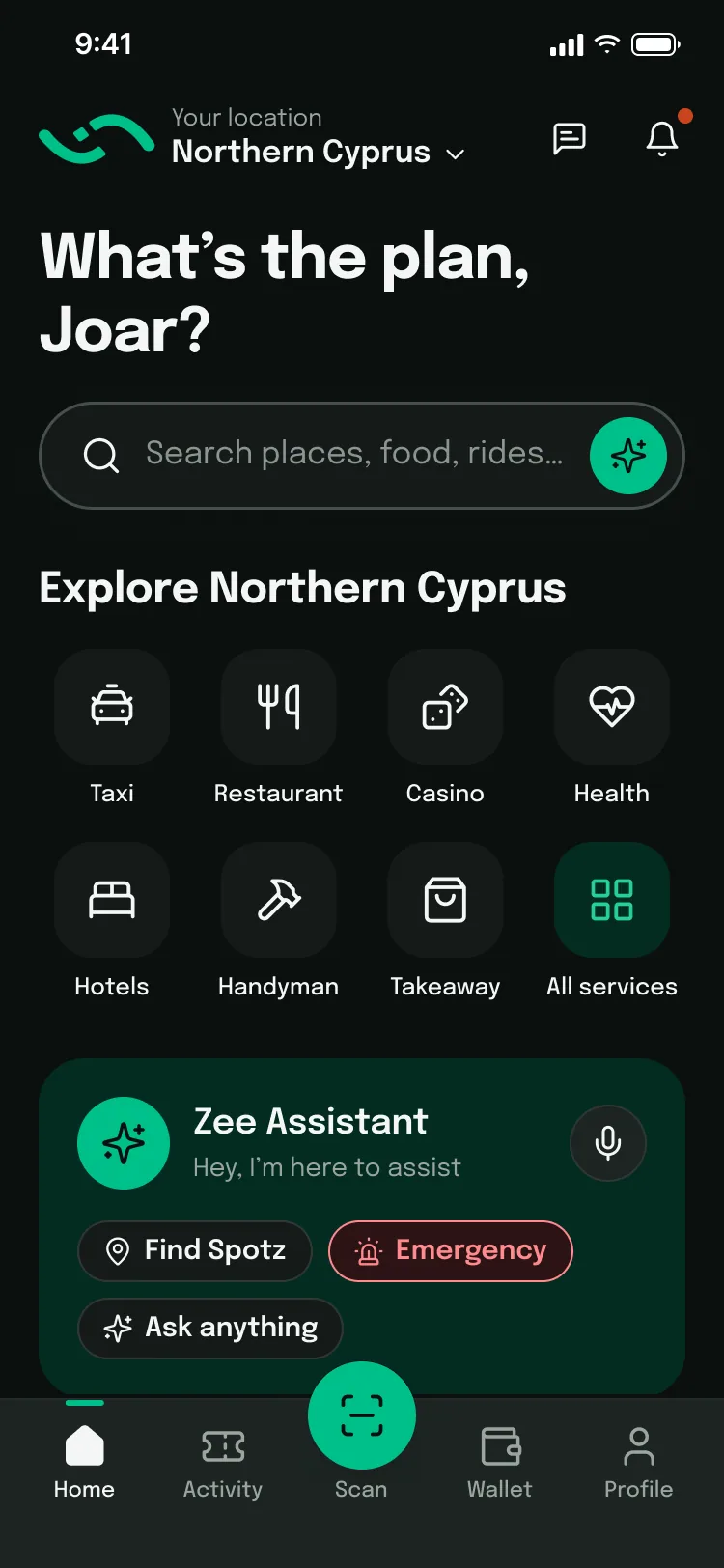
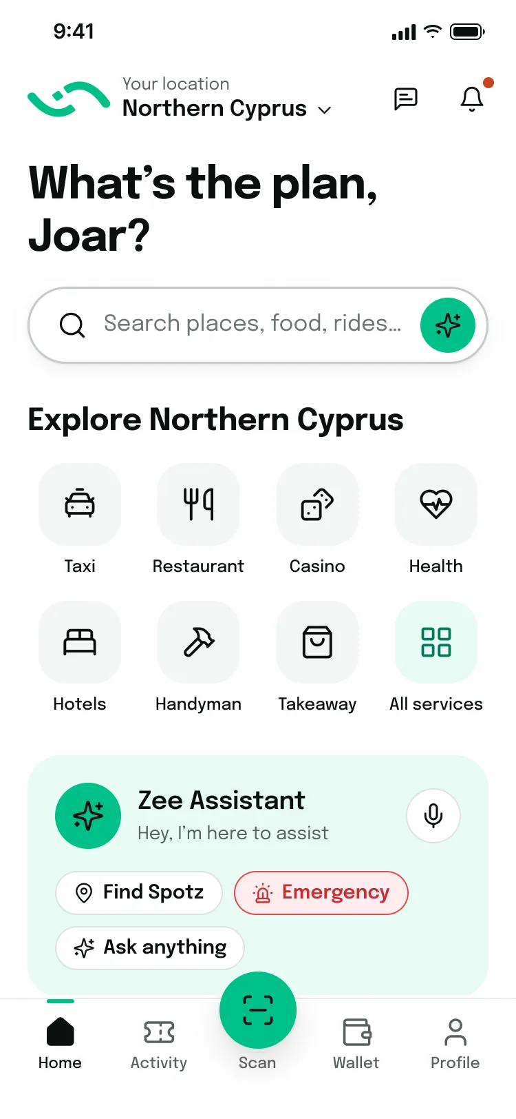
Semantic tokens support both light and dark themes.
WCAG 2.1 AA is a stated target, with contrast calculated from token values.
Colour is not used as the only carrier of meaning.
Epilogue brand typeface retained.
4px / 8px spacing rhythm and structured grid carried forward.
Light & dark
Semantic tokens support both light and dark themes — the same screen, two settings. Drag to compare.
Core visual tokens
Why the system mattered
Without reusable components, each new service meant another set of patterns. The system makes consistency a product capability: new services can reuse the same building blocks instead of behaving like new apps.
- Green 500#00c08b
green/500 - Green 50#e8fbf4
green/50 - Ink 900#151b19
ink/900 - Ink 50#f4f6f5
ink/50 - Coral 500#ff6a3d
coral/500
- TypefaceAaEpilogue — brand typeface, retained
Designing the ecosystem
Customer, partner and website
Spotz is an ecosystem, so the experience had to stay coherent beyond the customer app.
Partner experience
Partners receive the same booking details the customer saw — names, dates and amounts — so both sides of a booking stay aligned. The earlier project material also described vendor tools for registration, listings, bookings, payments and growth.
Edge cases
Design for the whole journey
A transactional product has to work when the happy path breaks.
Beyond the happy path
Empty
Explain what is missing and what the user can do next.
Loading
Communicate progress instead of leaving a dead screen.
Error
Explain what happened and provide a recovery action.
Offline
Explain what cannot be completed and preserve useful context.
No results
Use Zee as an additional route forward when normal navigation fails.
Design outcome
- Design outcome
Design artefacts
- 124 mobile screens
- 20 web pages/states
- 48 partner screens
- 72 components · 306 variants
- 1,030 prototype hotspots
- Success measures
Defined for future validation
- Booking completion
- Second-service adoption
- Cancellation rate
- Partner response time
These are design artefact counts, not business metrics.
What I learned
What I learned
Fix the model before the screens
Giving bookings a home was an architecture decision, not a visual one.
Consistency is a feature
Across a broad service ecosystem, one learnable pattern can be more valuable than many isolated optimisations.
Accurate content is UX
In a wallet and payments product, prices, locations and terms are part of trust.
Design for the ecosystem
Customer, partner and website experiences are connected; the solution has to work across the whole journey.
Spotz brings a complex service ecosystem into one understandable product: discover, book, pay and manage — with the same logic across the customer app, website and partner tools.