02 / SaaS Platform / 2026
Orvexa
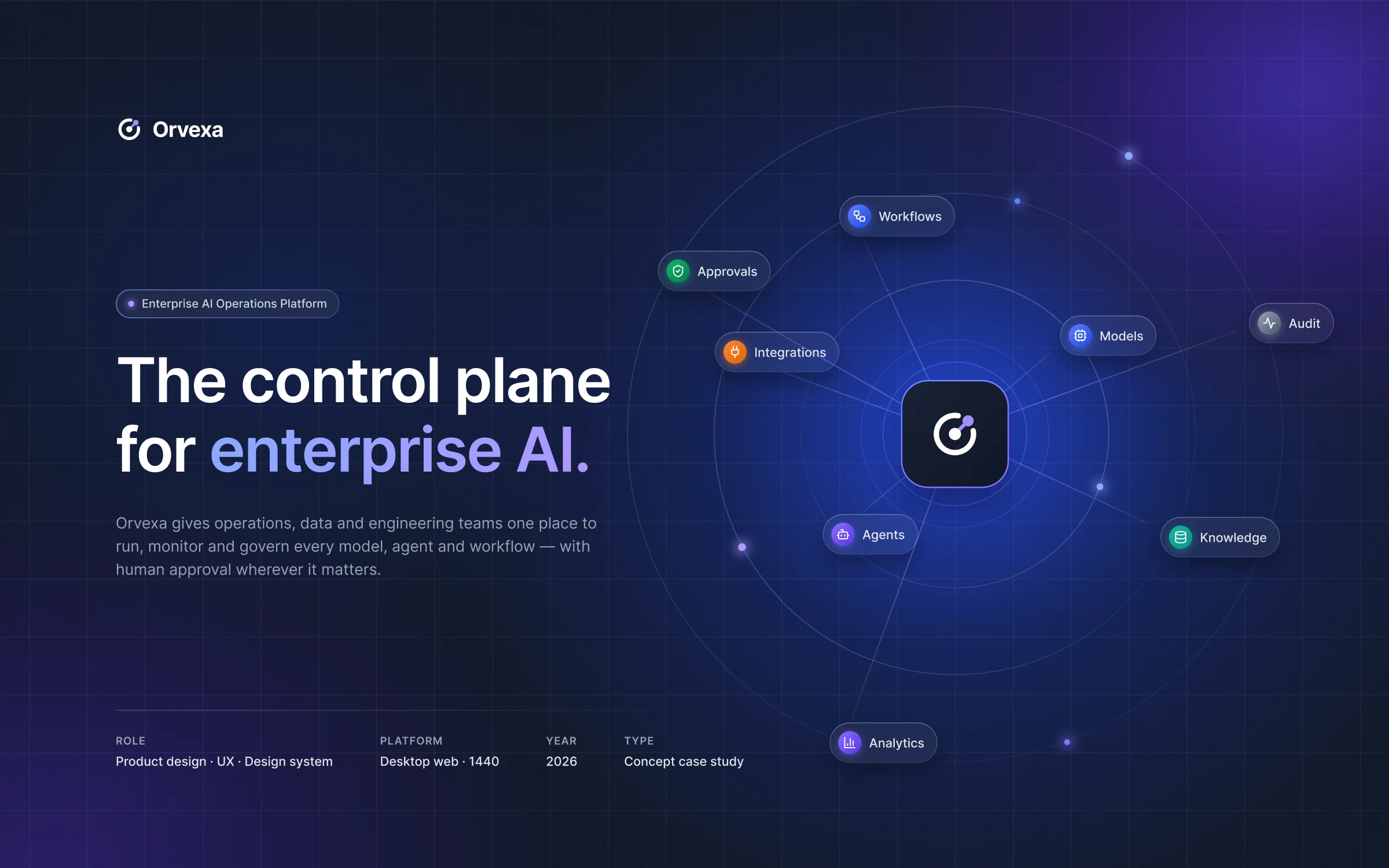
AI teams work across models, agents and data — but the work is spread across too many tools. Orvexa brings it into one place, from the first alert to the final audit.
Services
- Product design
- UX architecture
- Design system
- Brand identity
- Prototyping
At a glance
- The problem
- AI work is spread across models, agents and data sources. Teams need one place to see what is running, change it safely, and know who approved important actions.
- What I designed
- A single control plane with clear areas for monitoring, agents, workflows, data, approvals, analytics and audit.
- My role
- Product designer — product design, UX architecture, design system, brand identity and prototyping.
- Status
- Independent product study, 2026 — designed and prototyped, not built.
The context
AI tools are growing fast. Teams still need a simple way to control what AI can do.
- Status
- This study explores one operational layer for AI: a place to monitor work, manage changes, control access, review risky actions and keep a clear record.
- Core entities
- Projects · agents · workflows · knowledge · models · approvals · audit
The product is designed for operations leads, automation engineers, reviewers and workspace admins.
Problem discovery
Five questions the product should answer clearly
01 What we started with
- AI work was spread across tools. Teams needed clear answers to what is running, what it costs, what data it uses, what needs review, and who approved it.
02 What the review showed
- These answers were split across monitoring, setup, deployment, approval and audit tools. Risky actions could also be reviewed without enough context.
03 Problem statement
How might operators see, change and prove what their AI is doing — in one clear place, with human review when needed?
From the product brief.
Open questions
Questions the product should answer
The review was organised around five practical questions. Each one became a clear place in the product.
Which agents are running — and which are failing?
Operators need to spot problems early.
Overview · Agents
How much are we spending, and on which models?
Costs are easier to control when linked to projects and models.
Models · Analytics
What data can each agent access?
Access should be clear before an agent uses data.
Knowledge · Permissions
What actions are waiting for a person?
High-risk actions should not run without review.
Approvals
What did an agent do, and who approved it?
Teams need a record they can check later.
Activity & Audit
Problem statement and questions used as the starting brief.
Who it’s for
Designed for operators first
Reviewers and admins need the same core information, but for different jobs.
- Operate
AI operations lead
Watches uptime, cost and agent health.
- Spot problems early
- Trace problems to their cause
- Build
Automation engineer
Builds agents, connects tools and ships changes safely.
- Configure quickly
- Test before release
- Govern
Reviewer
Checks high-risk actions before they happen.
- See what will change
- Understand the risk
- Admin
Workspace admin
Manages users, access, SSO, API keys and audit settings.
- Know who has access
- Keep changes traceable
The goal
What the design needed to make possible
- Design goals
- See if anything is broken from Overview in seconds.
- Send high-risk actions through Approvals.
- Link spend to projects, agents and models.
- Keep agent changes versioned and reversible.
- Product KPIsNot measured yet
Future measures:
- Time to find and resolve incidents
- Share of high-risk actions reviewed
- Approval time
- Untracked spend
- Rollbacks after release
The approach
- 01
Calm control
Keep the UI focused. Show important status without visual noise.
- 02
Accountable AI
Show what happened, who did it, and who approved it.
- 03
Clear operations
Each screen should answer one practical question.
- 04
Enterprise trust
Use clear permissions, safe changes, repeatable patterns and an audit trail.
Information architecture
Eleven areas grouped by the questions they answer.
Daily work stays together. Admin settings sit outside the main operating flow.
Operate
“What is happening?”
- Overview
- Projects
- Agents
- Workflows
Build
“What can it use?”
- Knowledge
- Models
- Integrations
Govern
“Was it allowed, and what did it cost?”
- Approvals
- Activity & Audit
- Analytics
Admin
“Who can access it?”
- Users & roles
- Security & SSO
- API keys
- Billing & usage
Every screen
- Same sidebar
- Clear project scope
- Actions show who did them
Key journey
From the first alert to the final audit
- User goal
- Notice a problem, understand it, change the agent safely, and see what happened later.
- The challenge
- The journey crosses monitoring, setup, deployment, workflow, approval, analytics and audit tools.
- Design response
- Connect the steps in one sidebar so each screen keeps the context from the previous step.
01Monitor
Overview
Show incidents first, then the main numbers.
02Understand
Agent overview
Show identity, health and current status clearly.
03Configure
Agent configuration
Show AI suggestions as changes that can be reviewed before they are accepted.
04Deploy
Create agent
Move from draft → evaluation → shadow mode → production.
05Orchestrate
Workflow builder
Block Publish when a required step or safety check is missing.
06Approve
Approval
Show what will change, who requested it, why it matters, the risk and the expected result.
07Measure
Analytics
Show changes on the timeline so teams can connect events with results.
08Audit
Audit event
Show the actor, target, scope, source, result and what changed.
Key takeawayGovernance should be part of the same workflow — not a separate tool added at the end.
Workflow
Connect a company data source safely
- User goal
- Give an agent access to a company data source.
- The challenge
- Data access can create privacy and permission risk.
- Design response
- Choose the source, limit the data, review permissions, then connect it.
01Choose
Pick a source
Choose which company data the agent can use.
02Scope
Limit what the agent can read.
03Permissions
Sync and permissions
Confirm the source, access level and data scope before connecting it.
04Done
Connected
The data source is ready for the agent.
Key decisions
Making AI safer and easier to control
Decision 01
Show status before detail
- Challenge
- Operators need to know quickly if something is wrong.
- Decision
- Start with an incident banner and a small KPI strip. Rank issues by impact and give each one a next action.
- Why
- The screen should answer one clear question.
- What it enables
- Users can move from “what is wrong?” to the failing step quickly.
Decision 02
Show AI changes as diffs, not chat
- Challenge
- Agent setup can be high-risk. Chat can make changes hard to review.
- Decision
- Show AI suggestions as inline changes, with a test view and version history.
- Why
- Changes stay visible and can be reversed.
- What it enables
- Faster setup without hiding what changed.
Decision 03
Use a safe path to production
- Challenge
- A new agent can affect real data as soon as it goes live.
- Decision
- Use draft → evaluation → shadow mode → production.
- Why
- Show risk before the click, and make the first production step safer.
- What it enables
- Deployment becomes a clear decision instead of a single toggle.
Decision 04
Make human review quick and clear
- Challenge
- Reviewers may not have enough context when approving a risky action.
- Decision
- Show what, who, why, risk and outcome first. Then show the exact changes.
- Why
- A reviewer should be able to say yes or no with confidence.
- What it enables
- Human review stays useful without becoming a bottleneck.
Decision 05
Show access before you grant it
- Challenge
- A role change can quietly give people or agents more access.
- Decision
- Preview the final access before saving, then record the change in the audit log.
- Why
- People should see the result of a permission change before it happens.
- What it enables
- Admins can review the impact before they save.
Design intent only — these outcomes were not measured in a live product.
Trade-offs
Each choice gives up something. The goal was to keep risky AI work visible, reviewable and safe without making everyday work too slow.
Let agents act on their own everywhere.
Send only high-risk actions to human review and keep an audit record.
Adds some time to automated work.
Use a chat assistant to configure agents.
Show AI suggestions as reviewable changes with version history.
Less conversational, but easier to review.
Use one simple deploy button.
Use draft → evaluation → shadow mode → production.
More steps before an agent goes live.
Use spacious screens for everyone.
Use dense information with quiet UI for operators.
Harder for occasional users to scan.
Use colour freely across the product.
Keep purple for AI work and use other colours for actions and status.
A narrower palette, but clearer meaning.
The product
Oversight and audit, in context
Design system
Use colour to show meaning
In a busy enterprise tool, colour should have a clear job. Blue is for actions and selection. Purple is for AI work. Green and red show status, with text so colour is never the only signal.
- Blue 500#315bff
Action / selection - Purple 500#6c4dff
AI work - Gray 900#101828
- Gray 50#f8fafc
- Green 500#12b76a
Success - Red 500#f04438
Error
- UIAaInter — interface and data
- Mono{ id }Geist Mono — IDs, code and diffs
Design outcome
A clear end-to-end product direction
- Delivered
- End-to-end product design
- Brand identity and a two-tier design system
- 11 product areas and 8 end-to-end flows
- Data, feedback and navigation components
- Structured
- Monitoring, change, approval and audit in one path
- Permissions shown before they apply
- AI work visually distinct across the product
- Next
Test the incident-to-audit journey with operations teams and connect the design to real model and data sources.
What I learned
Name the result
Clear button labels can make risky actions easier to understand.
Use colour with purpose
A dedicated AI colour helps users spot AI-generated work.
Organise by questions
Grouping areas around the questions users need to answer keeps a large product easier to navigate.
Keep powerful tools calm
The product should make actions visible, explainable and reversible.